Quick Answer
In recent years, the music industry has experienced a refreshing transformation in music sheet design, embracing modern font styles to enhance readability and visual appeal. By incorporating these fonts, musicians enjoy improved clarity and a presentation that aligns with contemporary aesthetics.
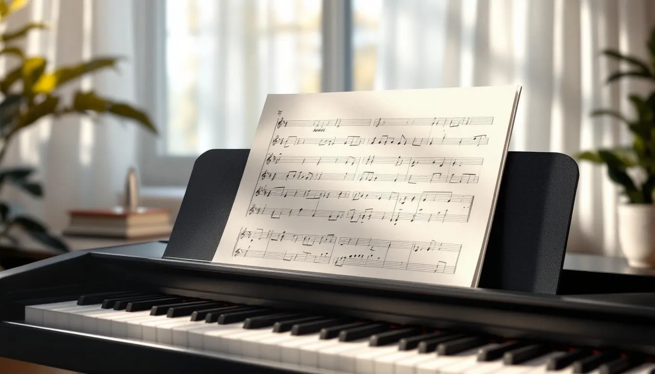
Modern music sheets are adopting new font styles to improve clarity and meet current visual trends.
Let’s explore how these modern font trends are reshaping the way music is read and appreciated.
What Are Modern Font Trends in Music Sheets?
Traditionally, music sheet fonts focused on classic and functional styles. Many classic scores can be found in their original form on the IMSLP (International Music Score Library Project), an extensive online library of public domain music scores. However, recent trends reveal a shift toward contemporary designs that blend aesthetic appeal with practicality. This evolution moves away from serif-heavy fonts, like Times New Roman, to streamlined, sans-serif options. These new fonts often feature cleaner lines and more spacious layouts, benefiting musicians who previously struggled with tiny notes. Tools like MuseScore, a free music notation software, allow composers to experiment with these modern layouts.
Some popular fonts making an impact include:
- Avenir Next: Known for its modern yet timeless feel, Avenir Next offers clarity and elegance, making navigation easier.
- Roboto: With friendly, open curves, Roboto provides a contemporary, professional look, suitable for both digital and printed sheets.
- Lato: Balancing stylistic elegance and readability, Lato offers a warm, inviting appearance appreciated by musicians.
In my music classes, students have noted how much easier it is to follow along when notes and text are clear and well-spaced. This small change significantly enhances the learning process. These fonts are not just about improved readability; they represent a broader acceptance within the music community, influencing future generations of musicians.
How Do New Fonts Improve Readability?
Readability is crucial in music sheet design, and modern fonts are central to this improvement. Factors like letter spacing, line thickness, and contrast between notes and background all contribute to better readability. Modern fonts are crafted with these elements in mind, allowing musicians to read and interpret music effortlessly.
When comparing traditional fonts with modern ones, differences are evident. Traditional fonts often featured ornate designs that, while beautiful, posed challenges during fast-paced performances. Consider it like reading an old calligraphic script—aesthetically pleasing but inefficient. Modern fonts prioritize simplicity and clarity through:
Traditional vs. Modern Fonts: A Comparison
As a music teacher, I’ve observed how these improvements positively impact students’ performance. One student, who struggled with sight-reading, found a modern font made a significant difference. The clarity boosted their confidence with every practice session. Beyond just fonts, tools like the Piano Companion app, a music theory app for songwriters, producers, teachers, and students, also play a crucial role. This flexible piano chord and scale dictionary with user libraries, reverse mode, circle of fifths, and a chord progression builder, helps students understand and visualize music theory, assisting in finding chords or scales by key or MIDI keyboard, and even creating custom ones for their user library.
These font advancements are functional upgrades supporting musicians in their craft.
What Aesthetic Trends Are Influencing Font Changes?
In a visually driven world, design trends evolve rapidly, and music sheets are no exception. A key trend driving font changes is minimalism and simplicity. This approach is not just about aesthetics but creating a seamless reading experience that allows musicians to focus on performance. For an engaging look at how modern aesthetics can apply to music theory, check out the 8-Bit Music Theory YouTube Channel, which analyzes video game music.
Digital media and technology significantly influence these trends. With the rise of online music platforms and digital sheet music, fonts must look great on screens of all sizes. Sans-serif fonts, often more readable on digital displays, are particularly beneficial for tablets and smartphones.
Personalization also plays a crucial role in font selection. Musicians, like artists, have unique styles and preferences, and choosing fonts that reflect their brand or genre is increasingly important. A jazz musician might prefer a font with flair, while a classical performer may opt for something traditional yet modern.
As aesthetic trends shape the landscape, music publishers adapt to meet musicians’ evolving needs. Whether responding to digital demands or individual tastes, the future of music sheet design promises to be as dynamic as the music itself.
How Are Music Publishers Adapting to New Font Styles?
In music publishing, adapting to new font styles enhances the musician’s experience. Publishers are integrating modern fonts into their sheets, recognizing this as both an aesthetic and strategic move.
Recently, a leading music publisher switched their entire catalog to Avenir Next, reporting increased sales due to improved readability and modern aesthetics resonating with younger musicians. This change wasn’t merely aesthetic; it was a strategic effort to make music more accessible and appealing.
Feedback from musicians and educators has been overwhelmingly positive. In a survey by a music education platform, many teachers, including myself, noted that students found contemporary fonts easier to read, boosting their engagement and confidence. One colleague mentioned her students were more motivated to practice, as the music felt more relatable.
Publishers are also experimenting with customizable fonts, allowing musicians to select styles that best suit their needs. This personalization is especially popular among professional musicians who want their sheet music to reflect their unique style.
What Are the Challenges of Adopting New Fonts?
While the shift to modern font styles is exciting, it presents challenges. One primary hurdle is resistance to change. Musicians and educators can be creatures of habit, attached to traditional fonts. They might fear new styles could disrupt their reading flow or require a steep learning curve.
Strategies to ease this transition include gradual integration. Instead of overhauling entire libraries overnight, publishers and educators can introduce new fonts alongside familiar ones, allowing musicians to adjust at their pace. Offering tutorials and workshops can also help familiarize users with new designs.
Technical challenges arise in ensuring new fonts are compatible across various platforms and devices. I’ve encountered glitches when printing digital sheet music in new fonts, finding skewed layouts. Publishers must invest in thorough testing and provide technical support to help users overcome these hurdles.
Despite these challenges, the benefits of modern fonts often outweigh initial growing pains. As musicians and educators embrace these changes, the journey toward a more visually appealing and accessible music world is promising.
Key Takeaways
- Modern fonts in music sheets enhance readability and align with current visual trends.
- Improved clarity and presentation boost musicians’ confidence and engagement.
- Publishers adopt fonts like Avenir Next and Roboto for their clarity and aesthetic appeal.
- Challenges include resistance to change and technical compatibility issues.
- Musicians should experiment with different fonts to find what best suits their style and needs.